
TL;DR
SharePoint’s 2025 design refresh brings a sleek, flexible, and brand-friendly facelift that makes intranets feel more human and less… corporate beige.
In this post, we cover:
- Why design matters more than ever (hint: it’s not just about looking good)
- The most common SharePoint design mistakes and how to avoid them
- What’s new in SharePoint’s 2025 design toolkit
- Our top tips for creating intranets people want to use
- Answers to your most-asked design questions
If your homepage feels more ScarePoint than SharePoint, read on.
What the Webinar
We recently hosted a lively webinar with Chloe Dervin, Managing Director at WebVine, and Rachel Harnott, our Head of Modern Work, diving into SharePoint’s shiny new design features for 2025.
Prefer to read instead of watch? No worries, here’s the highlight reel of what we covered. Because intranet design doesn’t have to be scary.
Why Great Design Matters in SharePoint
Design isn’t only about nice colours or clean layouts. It’s the invisible structure that shapes how people feel when they use your intranet.
Think of it like walking into a beautifully designed café versus a messy garage. One says “come on in,” the other says “turn back now.”
Good design:
- Makes things easy to find. If your intranet feels like a maze, users will escape back to email. Or worse, start asking IT where things live.
- Drives adoption. People come back to tools that feel intuitive and visually welcoming.
- Improves accessibility. Thoughtful design means everyone can participate. Consider contrast, font choices, and keyboard navigation.
- Strengthens your brand. A well-branded intranet feels like your organisation, not a Microsoft template with a logo dropped in the corner.
At WebVine, we see time and again that design is the difference between an intranet that’s used and one that’s ignored.
Common SharePoint Design Mistakes (and How to Avoid Them)
Even the best intentions can lead to design disasters. Here are the usual suspects, and how to avoid them:
Overcrowded Pages
If your SharePoint homepage looks like a teenager’s bedroom (everything everywhere all at once) it’s time for a clean-up.
Keep copy concise (around 500 words per news page), use headings and white space, and let visuals do some of the talking.
Inconsistent Branding
Mixing fonts and colours might seem small, but it’s like using four different coffee mugs for one set. It just doesn’t feel right. Use the SharePoint Brand Centre and templates to stay consistent.
Poor Navigation
Listing every page in your menu is like handing someone a map of Sydney with every side street marked. Focus on clarity, not quantity. Group pages logically so users always know they’re on the right track.
Ignoring Mobile
If your intranet only works on desktop, you’re leaving mobile users stranded. Modern work happens everywhere. Design for every screen.
Not Considering Accessibility
Accessibility isn’t a “nice to have.” Use SharePoint’s built-in tools to check contrast, readability, and keyboard navigation. Your design should welcome everyone.
What’s New: SharePoint Design Features for 2025
2025’s SharePoint refresh introduces features that make it easier than ever to create beautiful, functional, and on-brand intranets.
Flexible Layouts
Stack sections, use full-width banners, and drag-and-drop web parts for visually dynamic pages. It’s like moving from Lego blocks to Minecraft, more freedom, more creativity.
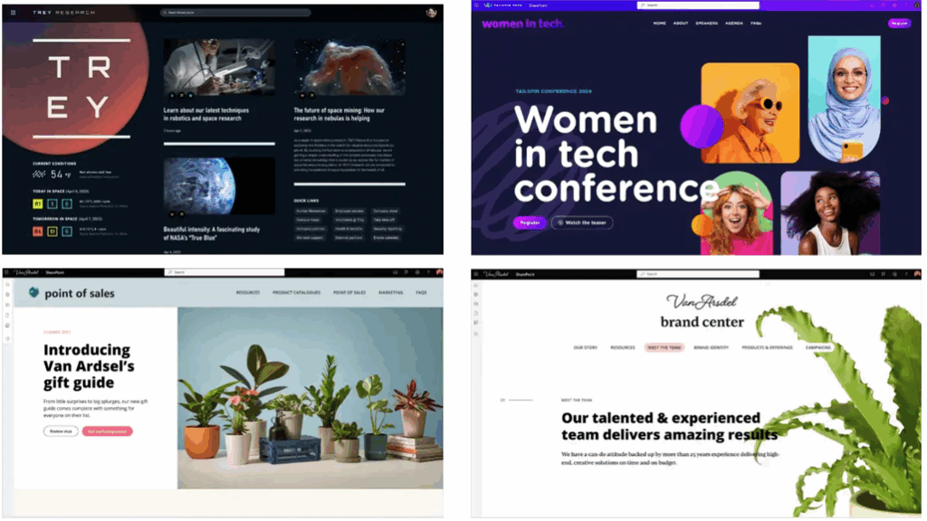
Examples of homepages using SharePoint's Flexible Layouts
Animated Backgrounds and Gradient Overlays
Add subtle movement and depth to your pages with animated backgrounds and gradient overlays. Just don’t go full 1999 with dancing GIFs. Keep it classy and lightweight.
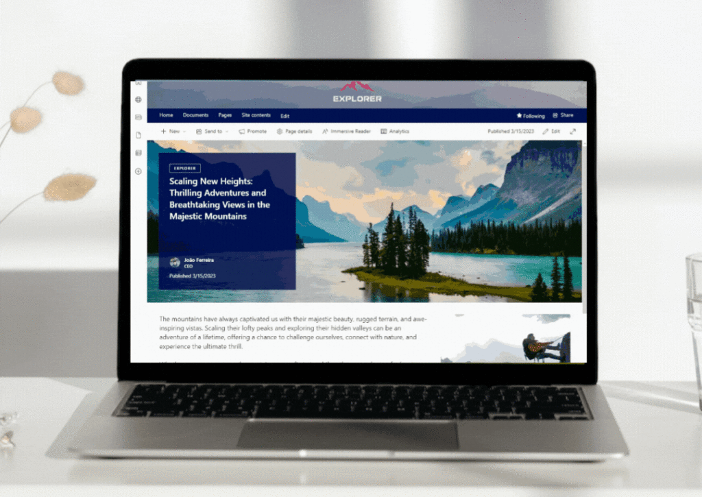
Example of a lightweight animated background in SharePoint
SharePoint Brand Centre
Centralised control of fonts, colours, and themes means every page matches your organisation’s look and feel.
Say goodbye to rogue Comic Sans or mystery purples.
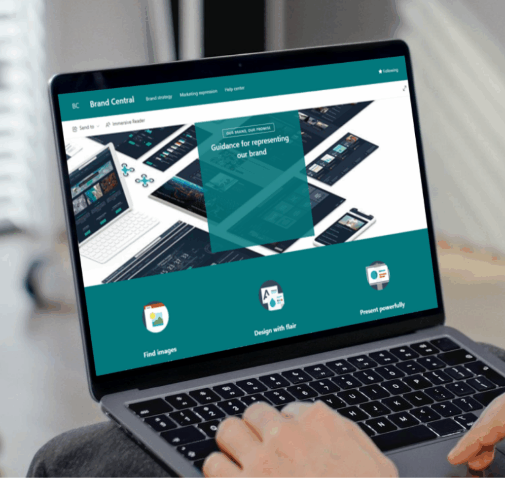
SharePoint Brand Centre
Copilot Enhancements
Copilot can now assist with layout suggestions and design tweaks. It’s like having a design coach whispering in your ear.
Hero Link Sharing
Share files with a single persistent link and visual preview. Users instantly see what’s being shared, making collaboration smoother and more confident.
Hot Tips for SharePoint Design Success
If you’re ready to give your intranet a glow-up, here’s what our experts recommend:
- Put users first. Every design decision should make the experience simpler and more inclusive.
- Align with business goals. A redesign isn’t about trends. It’s about supporting your people and purpose.
- Be consistent. Don’t refresh one page and forget the rest.
- Create a design language. Document your look and feel so content owners stay on-brand.
- Bring content owners along. Run training, share guidelines, and make sure everyone knows the “why.”
- Use quality visuals. Think more “Instagram-level polish,” less “PowerPoint clip art.”
- Balance form and function. A pretty homepage with outdated info still fails. Use SharePoint Knowledge Agent to flag low-engagement pages.
- Keep learning. Track analytics, gather feedback, and refine over time. Microsoft Clarity is great for this.
Practical Advice
- Compatibility with current intranets: All these features are available in modern SharePoint environments including our Injio intranets. Classic users, time to modernise!
- Testing new designs: Make a copy of your homepage and keep it in draft, or use a test site. Only go live when you’re ready.
- Licensing for SharePoint Knowledge Agent and Copilot: Knowledge Agent relies on Copilot licensing, with a small per-request fee. It’s not expensive, but check who needs access.
- Starting an intranet from scratch: Check out the SharePoint Lookbook for templates, and talk to consultants or other organisations for inspiration.
WebVine’s Homepage Refresh Offer
Feeling inspired but not sure where to start?
Reach out to refresh your SharePoint homepage for a fixed investment. Modern design, improved usability, and alignment with your organisation’s brand and values.
About the Speakers
Chloe Dervin, Managing Director, WebVine
Chloe is passionate about digital transformation and helping organisations energise their workplaces with Microsoft tools. Known for her engaging webinars and practical advice, Chloe brings a wealth of experience in intranet strategy and design.
Rachel Harnott, Head of Modern Work, WebVine
Rachel has 18+ years of experience in digital strategy, consulting, and development. She specialises in Microsoft 365 and SharePoint, helping organisations align technology with business goals and drive real transformation.
FAQ
Q: Can I use these new SharePoint features if my intranet is still on classic?
A: The new design features are available in modern SharePoint environments. If you’re still on classic, it’s a great time to consider upgrading.
Q: How do I test new designs without affecting my live site?
A: Create a draft copy of your homepage or set up a test site. Use permissions to restrict access until you’re ready to go live.
Q: Is the SharePoint Knowledge Agent available to everyone?
A: It requires Copilot licensing and incurs a small per-request fee. Check with your IT team or Microsoft rep for details.
Q: What’s the best way to start an intranet from scratch?
A: Explore the SharePoint Lookbook for templates, connect with consultants, and talk to other organisations in your industry for inspiration.
Q: Can WebVine help with a homepage refresh?
A: Absolutely! Contact us for a fixed-price homepage refresh and let’s make your intranet shine.
Sources