SHAREPOINT
Intranet Design Ideas
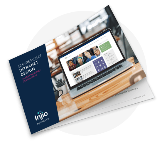
Intranet design is important. It will have a significant impact on intranet adoption, usage and ROI. This free report provides ideas and inspiration for an engaging employee intranet your team will love.
FREE REPORT
Intranet Design Ideas
Get 8 SharePoint intranet design ideas with this free guide
If design and usability are not prioritised, people will find engaging with your SharePoint platform difficult. Whether you are creating a new SharePoint intranet, building a communications or teams site or simply a document hub, strong design can be the difference between adoption and failure.


SHAREPOINT DESIGNERS
Design is one of the key elements to either elevate or degrade the user experience. Investing in branding and design will make your SharePoint platform much more appealing and likely to be used. Strong design will drive adoption and brand consistency builds trust and engagement.
Visual designs must be created with SharePoint in mind, so they fit with the technology platform. Ensure your designer is familiar with SharePoint online and is aware of the inevitable limitations. While SharePoint modern is easier to work with and much more responsive, this has come at the cost of flexibility of design.
SHAREPOINT HOME PAGE DESIGN
The homepage will be the default page that the site renders when you type in a URL address. This can be the main access point for your intranet or the launching page for your Document Management solution.
Conduct surveys and focus groups to understand what business users are expecting from the platform and prioritise these things in your home page design. Review analytics on your current system to identify the most popular areas, how people are reaching them and where they get stuck. Stakeholders will often push to feature their own pet projects or links on the home page and clear data showing what users want can be a good way to manage these demands.

MANAGING THE DESIGN PROCESS
The usual website approach of creating a Photoshop file and simply handing it over to the developers will not work with SharePoint. It’s best to get everyone on the same page as early as possible. Because SharePoint modern is so easy to drag and drop webparts and design elements, it’s often easiest and most efficient to simply create model pages and edit them together rather than muck around with wireframes. This not only takes a step out of the design process but shows stakeholders something that is much closer to the actual outcome, reducing misunderstanding and avoiding disappointment later.
INTRANET DESIGN
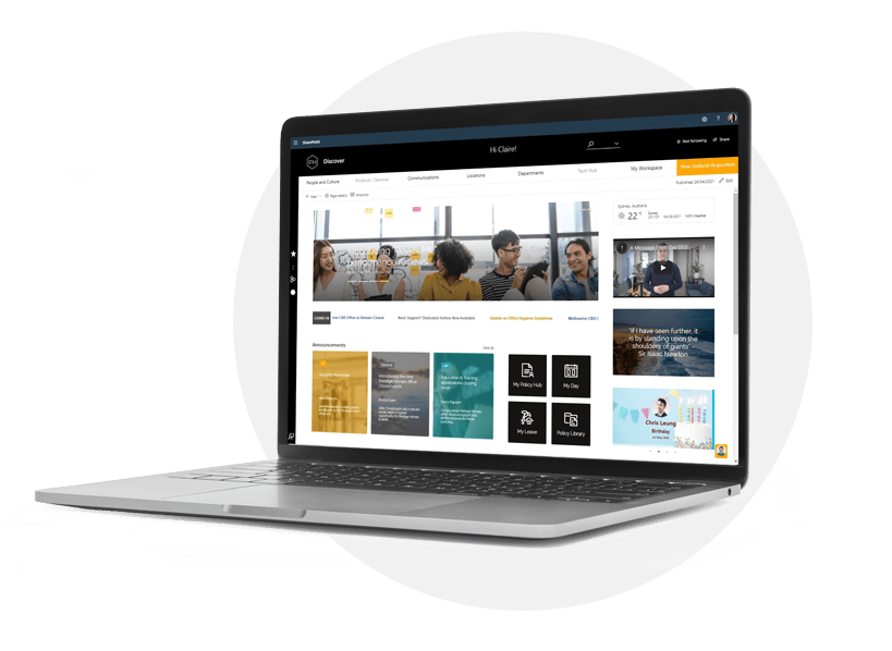
A good intranet should feel trustworthy and familiar, providing clear pathways for people to find information, understand the company culture and connect with each other. It might contain components such as:

News and Announcements

App Links / Resources

Events Calendar

HR Policies and formal company documents

Business Processes
However intranet design must go beyond branding, colours and fonts. It encompasses the user experience from navigation to readability to search. If you are going to engage the services of a SharePoint consultant, it’s probably best to make the investment in design and navigational experience.
INJIO: SHAREPOINT INTRANET
ERRORS IN INTRANET DESIGN
- Top down. Intranet content should not be exclusively curated and legally reviewed corporate
communications. Allow for some user-generated content and work out how it will be reviewed and
managed. - Replicating your brand website. Public-facing sites need to achieve different things to employee portals and are generally built on different technology. Optimise your intranet for productivity and connection.
- Not prioritising search. Many people – especially younger employees – prefer to search rather than navigate using the menu. Both pathways must be clear and effective.
- Insufficient user testing. Unless you want to find out if your design is wrong after launch, give a test group some common tasks and make sure they can complete them in a reasonable space of time.
- Designing intranet structure around the org chart. It’s not how people think or search, it’s difficult for new starters and it’s likely to change.
- Lack of customisation. Everyone is different and uses unique ways to find and remember things. Allow them to make their intranet more useful by saving links or pinning content.
- Set & forget. Your SharePoint design will likely be impacted over time by Microsoft updates, new technology and changes in design aesthetic. Make sure you have an annual review pencilled in with stakeholders.
SHAREPOINT CONSULTING SERVICES
For consulting, advice or designs, please get in touch